A file is a record of what you saw. A print is the thing itself, and which surface you choose decides how much of it survives.
There is a moment every photographer knows and almost nobody talks about. The shot worked. The light was right, the composition held, the subject cooperated or the landscape was generous. You processed it, lived with it, doubted it, went back to it. And then it sits on a hard drive, silent, seen only when you go looking for it.
Black and white carries a particular weight here. Take the color out and you force a viewer to look differently, at form, at tone, at the geometry that color so often distracts from. The photograph becomes about something more elemental. Which is exactly why it deserves better than a monitor.
A good monochrome image, printed well and given wall space, becomes a different object. It holds differently. The gray tones that read as subtle on a screen open into real depth on paper or behind glass. You stop scrolling and start looking.
What a print does that a screen cannot
The question every serious photographer arrives at eventually is not whether to print but how. Substrate, finish and scale are not packaging. They are part of the picture, in the same way that paper was part of the picture for every darkroom printer who ever lived. Choose them well and the photograph you already made simply becomes more itself.
Scale is the most immediate of the three. Give a quiet image room and it reads as deliberate, an invitation to stand in front of it rather than glance at it. A dense, detailed photograph rewards a closer format, where the eye can travel through the thing at its own pace. The useful test is to stand where the picture will actually hang, usually across a room rather than at arm’s length, and notice how long it holds you there.
Then there is light, which is the part people notice last and feel first. A screen pushes light at you, the same amount at breakfast as at midnight. A print is lit by the room it lives in. It shifts as the day moves across it, warms in the evening, goes quiet at dusk. That is why a photograph on a wall never looks like quite the same photograph twice, and why people keep returning to one long after they would have scrolled past the file.
That is the whole argument. The file is a record of what you saw. The print is the thing itself. The print is the point.
Where the pictures come from
Fotoviva came to our attention recently, an art print seller in Worcestershire that has been going quietly and seriously for twenty years. It began in 2006 with Jason Wickens, a photographer who bought his first DSLR in 2004 and never quite got over what the thing could do, and a website built to sell prints in what he calls a less crowded niche. It stayed that way for a while. Then other photographers saw what he was doing and asked whether they could sell through it too, and a collective formed around him.
That is still the shape of it. A small group of independent photographers, each with their own eye and their own subjects, offering finished prints on canvas, framed, or on acrylic. What they share is an insistence on the real. Every image on the site came from a photographer who stood somewhere, saw something and made a decision. Buy one and you own something a real photographer made, and that photographer is paid on the sale.
That framing will land with anyone who reads this site. We spend a lot of time here on what it means to see genuinely and to make pictures that are yours rather than versions of somebody else’s. Fotoviva applies the same thinking to the market for finished prints.
What is in the black and white collection
The monochrome collection runs to forty prints and it is where the curation shows. These are not decorative in the way most wall art wants to be. They have a point of view.
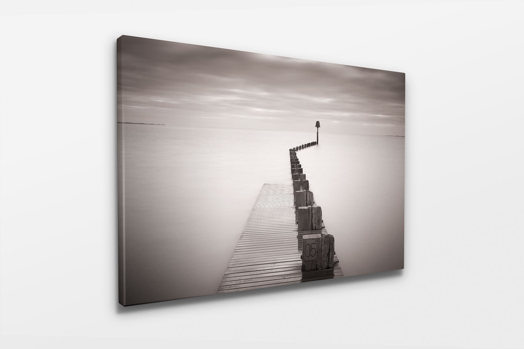
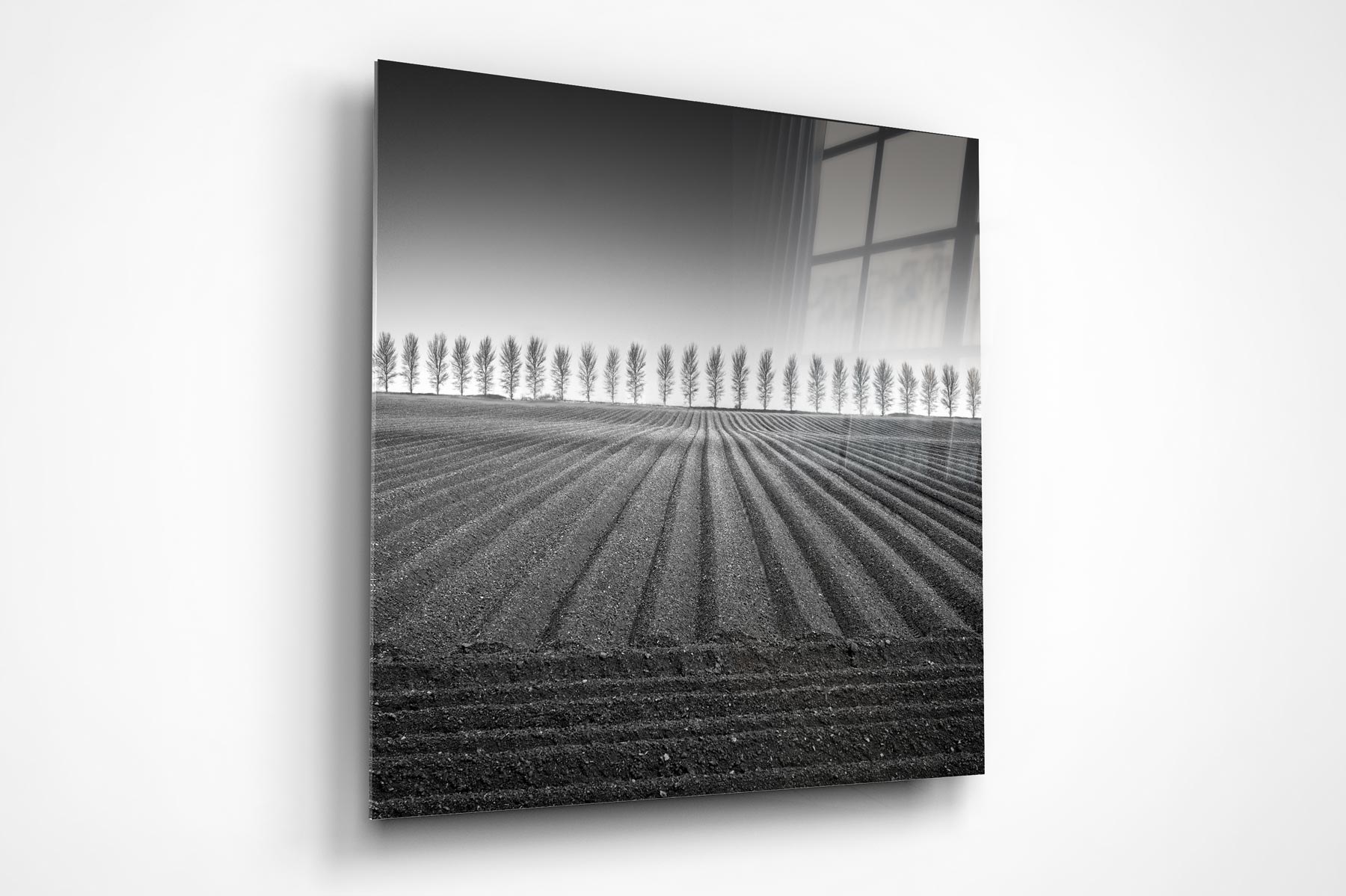
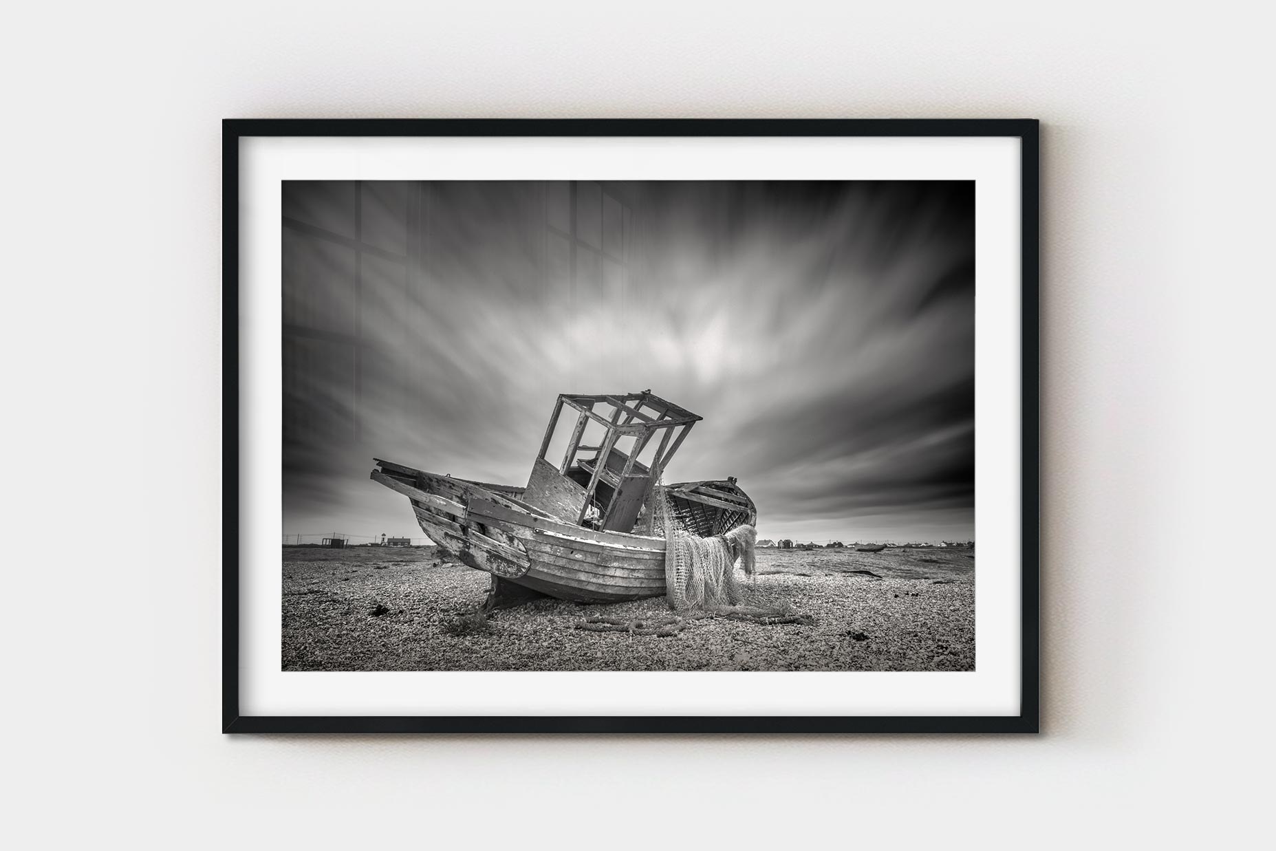
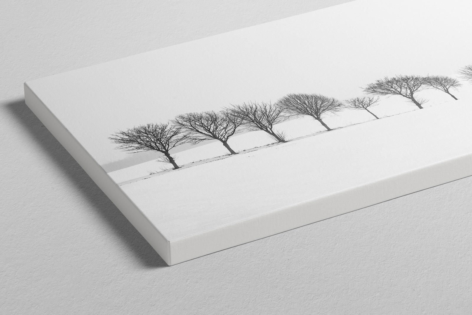
A long exposure pier running out into a glassy sea, the wooden posts walking the eye toward a horizon that offers no reassurance. A derelict fishing boat stranded on shingle with the sky streaking overhead, the kind of picture that carries the weight of time in it. Freshly turned furrows converging on a line of winter trees, all geometry and patience. A single dark hill with one small tree on it and one white cloud above, stripped back far enough to border on the philosophical.
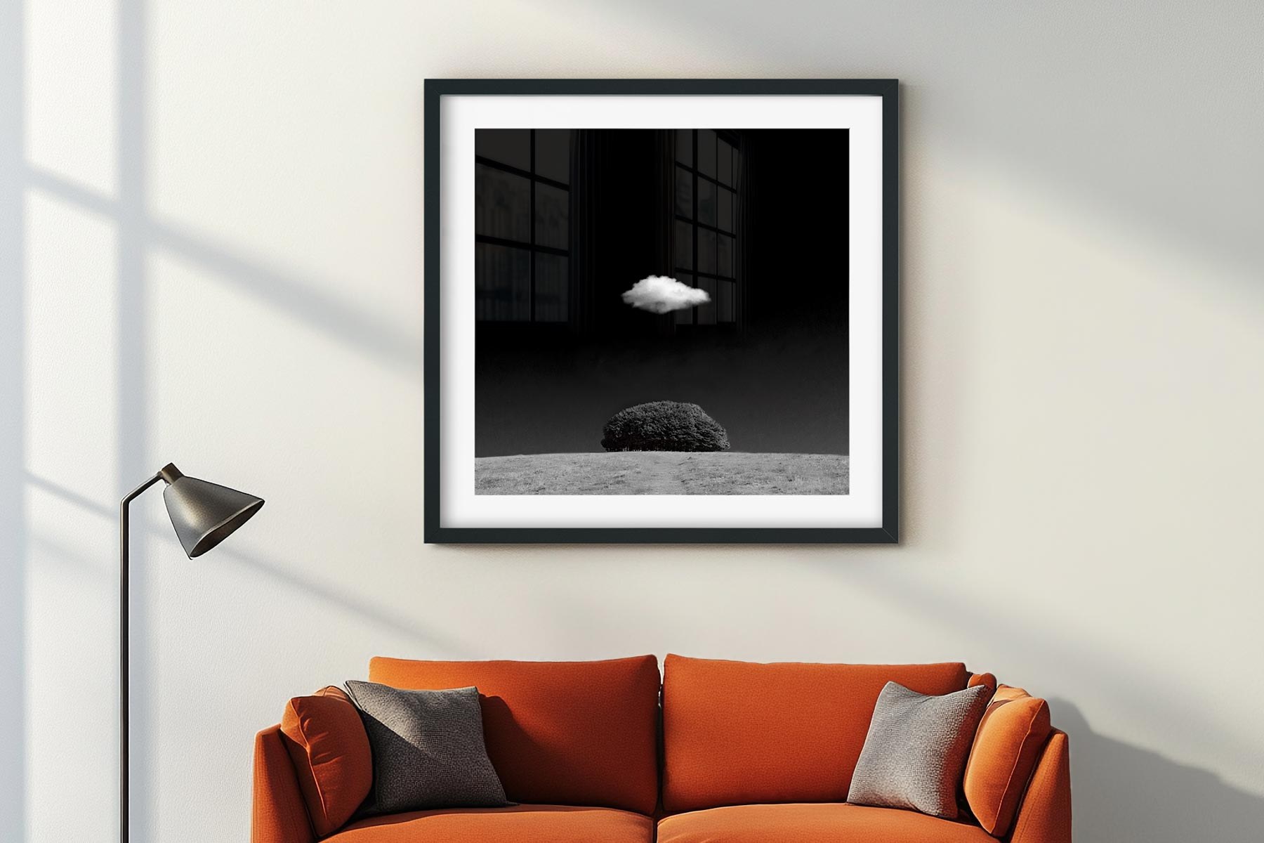
Any of these would hold a wall in a serious gallery, and that is the standard worth holding wall art to.
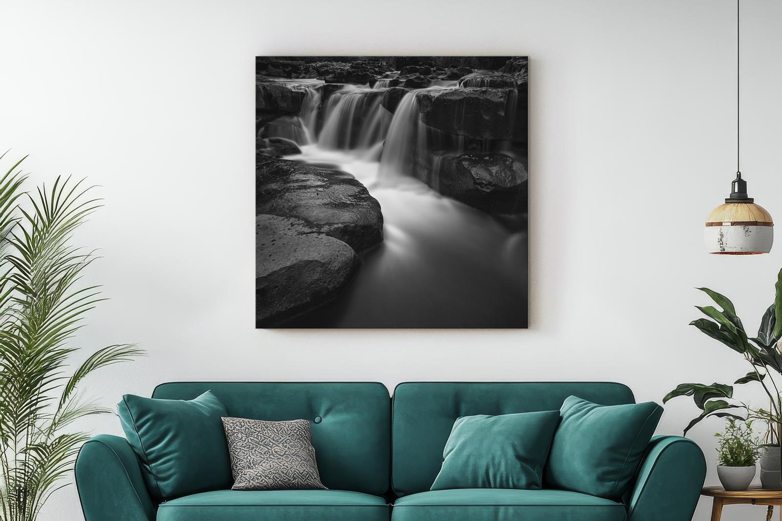
Canvas, frame or acrylic
Every piece comes on canvas, as a framed print, or on acrylic, and each of the three does something genuinely different for a monochrome image. This is not a ranking. It is a question of what you want the photograph to be in the room.
Canvas gives you presence without glass. Nothing sits between the viewer and the image, there are no reflections to plan the hanging around, and the weave has enough texture to make the thing feel like an object rather than a reproduction. It carries large sizes beautifully, which makes it a natural choice for a wide landscape or anything with sweep to it.
A framed print is the quiet one, and quiet is often exactly what you want. The mat gives the photograph space to breathe and tells the eye where to settle. Behind glass the blacks gain depth and the whites stay clean. It is the format that settles into a room most gracefully, which is the right instinct for a picture you intend to live with for years.
Acrylic is the one to look at if you have never tried it for black and white. The process gives the midtones an almost luminous quality while the blacks stay solid, and the surface throws a little light back into the room. For the fine grain, high contrast work that fills this collection it can be the most striking of the three.
The fishing boat makes the comparison easy, because Fotoviva offers it both ways. On acrylic the streaked sky keeps all of its movement and the whole picture has a lit from within quality. The same photograph framed behind a mat is calmer and more domestic, the kind of thing you notice again on a Sunday morning. Both are good. They are different objects, and the image does different work in each.
Fotoviva has set up a code for readers here. EXCLUSIVE10 takes 10% off whichever one you choose.
Twenty years of it
Fotoviva is in its twentieth year, which counts for something in a business where online sellers come and go with some regularity. Twenty years means twenty years of relationships with photographers, of orders fulfilled, of customers who came back. Jason and Carly Wickens run it as a family operation and the scale stays deliberate. The curation stays tight. The principle has not moved since 2006. Real photography belongs on walls and not only on screens.
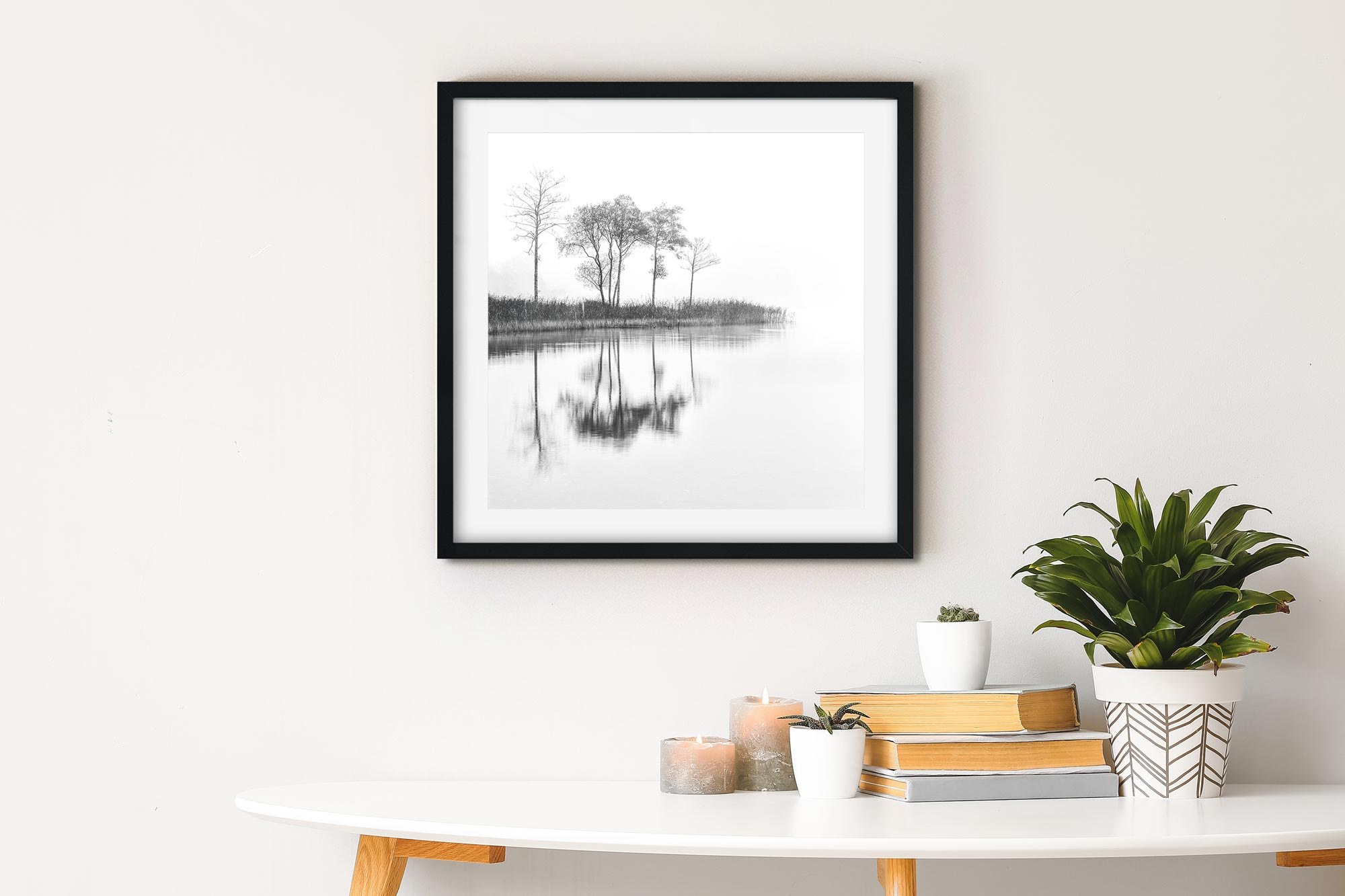
Go and look at the black and white collection at Fotoviva. When one of them stops you, and one of them will, try it in each of the three formats before you decide, because the same photograph really does become three different objects.
Then go and do the same for your own best frame, the one sitting on the drive. It has been waiting for a wall.
Fotoviva sells prints on canvas, framed and on acrylic at fotoviva.co.uk. Use the code EXCLUSIVE10 for 10% off.