Every phone can switch its screen to black and white. Most people use it to look at their phones less. We can use it to look more carefully.
Tucked away in the accessibility settings of every iPhone and Android phone is a switch that turns the whole screen gray. It was built for people with color vision differences. Over the last few years it has picked up a second life as a trick for breaking the phone habit, the idea being that a gray screen is simply less tempting to keep scrolling. That dullness is exactly what makes it interesting to anyone who works in black and white. Most of us look at more photographs on our phones than anywhere else, almost all of them in color, and this one setting lets us look at every one of them in tone instead.
Where the setting lives
On an iPhone it sits under Settings, then Accessibility, then Display & Text Size, then Color Filters. Once Color Filters is switched on, Grayscale is one of the options, and there is an intensity slider that is best left all the way up. It is also worth adding Color Filters to the Accessibility Shortcut in the main Accessibility menu. After that, a triple click of the side button flips the screen between gray and color, which comes in handy the first time a map or a chart needs its colors back.
On a Google Pixel the path is Settings, then Accessibility, then Color and motion, then Color correction, where Use color correction gets switched on and Grayscale chosen from the list. Samsung puts it under Settings, then Accessibility, then Visibility enhancements, then Color adjustment, although the exact name varies a little by region and software version. Other Android phones usually have something similar in their accessibility menu, and failing that, the Developer options menu on almost any Android phone has a setting called Simulate color space with a Monochromacy option that does the same job.
None of this touches the photographs we take. The filter only changes what the screen shows, so the camera keeps capturing in full color and screenshots save in color too. iPhone users who edit on the phone can go one step further with the Shortcuts app, which can switch the filter off automatically whenever Camera or Photos opens and back on when they close.
Everyone else’s photographs, in tone
This is the part worth the month. When we scroll through the same feed we look at every day, something happens within a few minutes. Some photographs come through completely intact, as strong in gray as they ever were in color, sometimes stronger. Others simply fall apart. The red umbrella against green grass turns into a gray shape on a gray field. The sunset that stopped everyone in their tracks becomes a pale smear. The bright market stall that looked so lively turns out to have no real light in it at all.
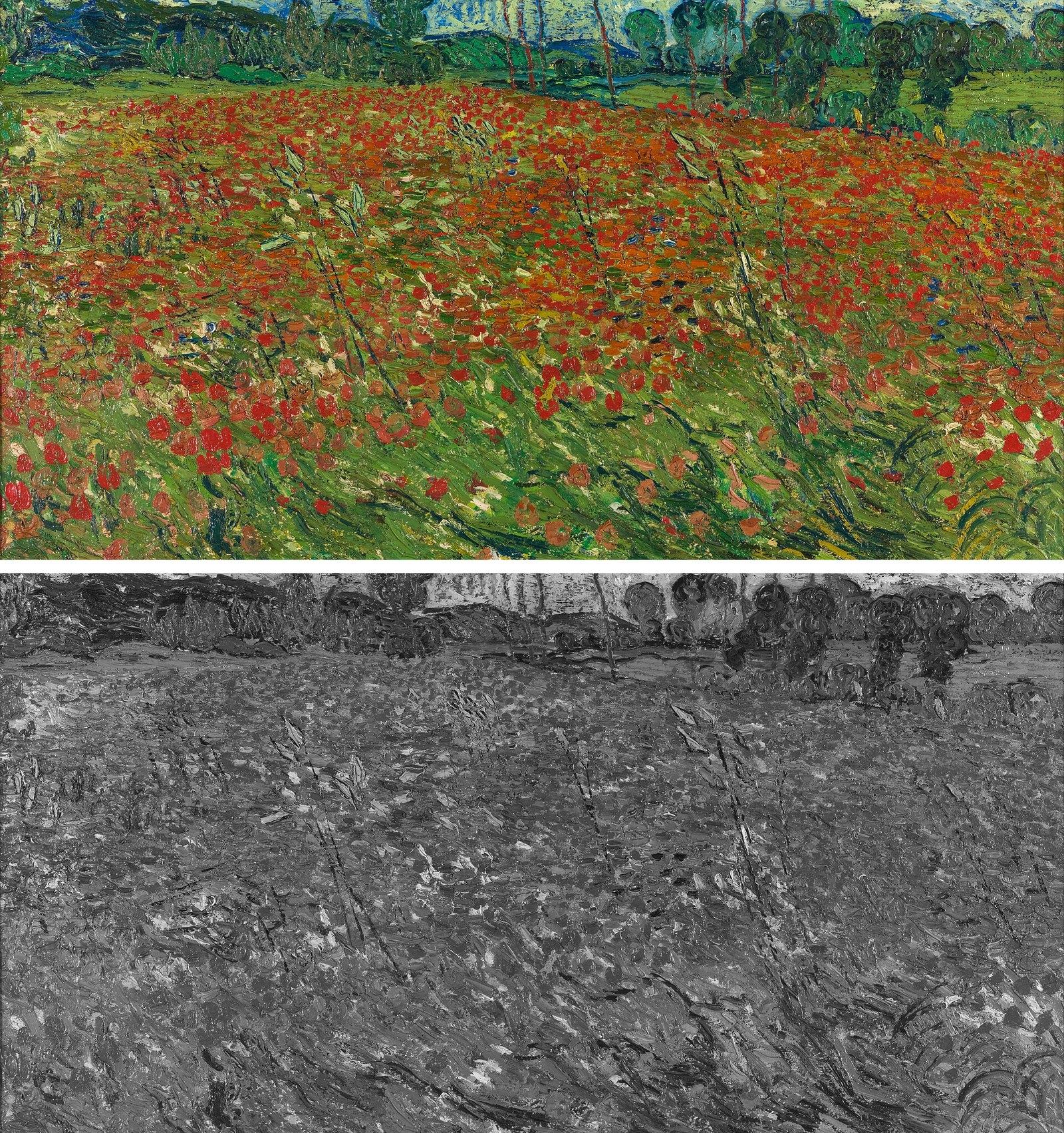
So what was holding those pictures up in the first place? What we are seeing, over and over, is which photographs were actually built on light and shape and which were only ever carried by their color. Color is very good at making a weak photograph look finished. Once it is gone, the structure underneath is all that is left, whether it is a strong pattern of dark and light or nothing much at all. After a few days of this, the feed turns into something close to a free lesson, run by thousands of photographers who had no idea they were teaching one.
The training that happens in between
The feed is only part of it. A gray phone means messages, maps, the weather app and faces on a video call all arrive in tone too, dozens of times a day, and none of it asks for any effort. Somewhere in the second or third week, most people notice they have started reading the world the same way, seeing where the brightest part of a scene is and where the darks gather before they notice what color anything is. That is the habit every black and white photographer is trying to build, and here it builds itself while we are doing something else entirely.
Holding the same mirror up to our own work
How would our own photographs fare? Sooner or later the obvious next step is our own camera roll. Scrolling back through a year of our own color photographs in gray is genuinely humbling, because the same thing happens to our pictures that happened to everyone else’s. Some of our favorites turn out to have been carried by a color we loved, and some frames we skipped past turn out to have the strongest structure of anything we shot. It is a quick and honest way to find the images worth converting, and an even quicker way to learn which kinds of scenes we keep photographing for their color alone.
Where the exercise falls short
The phone’s grayscale is a blunt conversion, with none of the careful adjustments we would make in an edit, so it is a harsher test than a finished black and white image ever faces. A photograph that collapses on a gray screen can sometimes be rescued by using the color editor during the conversion, pulling apart two colors that happened to land on the same gray. That is actually useful to know rather than a flaw in the exercise, because it tells us exactly where a conversion is going to need work. And a month is not a magic number. A week is enough to see the pattern. The month is what makes it stick.
The setting was put there so people would look at their phones less, and for most people that is exactly what it does. For those of us who care about black and white, it does something more useful, turning the thing we already stare at for hours into a quiet teacher of tone. The phone was always going to take up that time anyway. It might as well be training our eye while it does.