
The eye finds the lightest part of a photograph before it finds the subject. Every single time.
There’s a particular kind of failure that’s hard to diagnose. The photograph is composed the way we meant it, the subject sits where it should, the tones looked good on the back of the camera, and something still isn’t right. We keep coming back to it and our attention keeps sliding off toward a corner, or a patch of sky, or a doorway in the background we barely registered when we pressed the shutter.
Almost every time, the explanation is the same, and it isn’t a composition rule anybody teaches. The eye went to the lightest thing in the frame, and the lightest thing in the frame wasn’t what we wanted it to look at.
Brightness is the only currency we have left
In color, several things compete for attention at once. A saturated red holds its own against a wall that’s objectively brighter but duller. A patch of green reads as background even when it’s lit harder than the subject. Hue and saturation and brightness all argue with each other, and what a viewer looks at first is the result of that argument.
Take the color away and the argument ends. Luminance is the only thing left on the table. Whatever is lightest wins by default, regardless of what it is, how small it is, or how little it matters to the picture. A blown out window at the edge of the frame beats a human face in the middle of it, and it genuinely isn’t close.
Printers worked this out a century ago
This isn’t a new observation and it was never theoretical. Darkroom printers have been burning down the edges and corners of prints for as long as there have been enlargers. The reason usually given is that it keeps the eye inside the picture, which is right, though it’s worth saying plainly what the problem actually is. A bright edge is an exit. The eye travels to the lightest area, and when the lightest area sits at the border, it walks straight out of the frame and doesn’t come back.
Nobody needed a theory of perception for this. They noticed their prints worked better when the corners were darker, and they kept doing it.
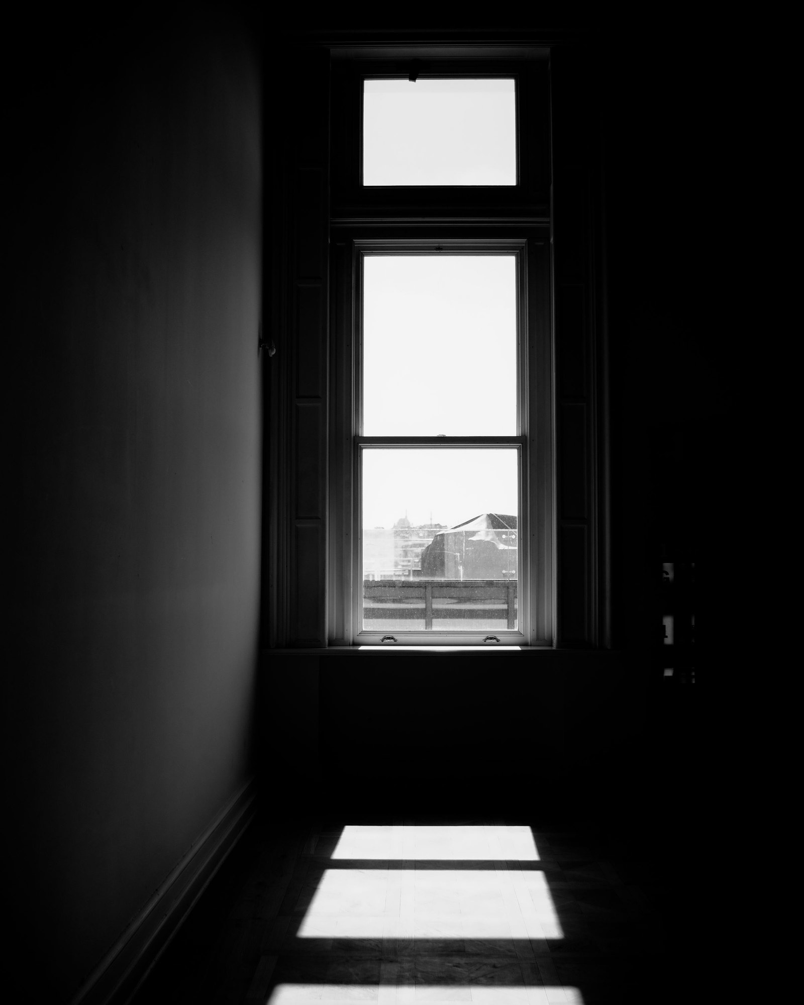
Seeing it before the shutter rather than after
Squint at the scene until the detail collapses and all that’s left is blocks of light and dark. Whatever still reads as bright is where a viewer is going to look. We’ve talked about squinting before, in the context of whether a frame feels balanced, and this is a different question asked with the same tool.
Balance is about whether the frame feels stable. This is about what gets looked at first, and the two aren’t the same thing at all. A photograph can be beautifully balanced and still send everybody’s attention to a lamp in the background.
The decision this actually asks for
The useful version of all this isn’t a rule about where to put things. It’s a question to answer before releasing the shutter. What is going to be the brightest thing in this frame?
Once that’s settled, the rest follows. Either the subject is the brightest thing, or it’s the thing with the most contrast against everything near it, or we move until the competing highlight is out of the picture. Waiting for a cloud. Dropping half a step left so the bright doorway goes behind a column. Exposing for the highlight we want to keep rather than the one we don’t. This is close kin to building the picture from the back, though it asks something different. That one is about whether the subject separates from its background at all. This one is about which of the things that already separate gets looked at first.
It’s a decision made at capture and it mostly can’t be repaired later. Darkening a blown highlight in editing gives us a gray patch where a bright one used to be, and a gray patch with no detail in it is simply a different problem.
When the brightest thing shouldn’t be the subject
None of this means the subject has to be the lightest thing. A silhouette works precisely because it isn’t. The bright field is the point, the dark shape reads as a hole cut in it, and the eye travels to the light and then finds the absence sitting in the middle. That’s deliberate, and it’s one of the oldest moves we have. The same goes for work that lives almost entirely down in the shadows, where a single small highlight carries the whole frame.
The failure was never a bright background. The failure is a bright background that nobody chose.
Two limits on this
The first is that this is about contrast against the surroundings rather than absolute brightness. A mid gray shape on near black pulls just as hard as white on gray. The eye is reading difference, not measuring values, which is why a photograph that looks flat on a histogram can still have a very clear place it wants us to look.
The second is that this is a claim about attention, not about balance. There’s a great deal of composition advice about which tones carry more visual weight in a frame, and that’s a separate question with a much less settled answer than the confidence of the advice suggests. It’s worth treating anybody who states it as a flat rule with a little caution. Where the eye actually goes first is the part any of us can test on our own photographs this afternoon.
Most composition advice is about arrangement, about where things sit and how they relate to the edges and to each other, and all of that matters. But arrangement assumes the viewer is looking where we think they’re looking, and in black and white that assumption gets settled by one thing before anything else gets a say.
Find the brightest thing in your frame. That’s where everyone is looking, whether you meant it or not.